Written by: Jessica Dumais

In an age of fast-paced trends, it’s important to keep up with what will capture the attention of your audience and make your design stand out from the rest. Using the stepping stones from past trends with rising, new trends creates a constantly-evolving look of branding and graphic design that remains relevant and engaging.
Doodles
One of the trends on the rise is doodles in graphic design. This ranges from a simple nod to 90s grunge doodles (think stars and squiggles that we all plastered to the front of our school binders and notebooks), to more elaborate and effective cartoon illustrations. Pairing these hand-drawn doodles with graphic text gives a more authentic, ‘human’ feel to brands as they incorporate the classic charm of designs that have life and love poured into them in the midst of the rise of AI-generated content.
Maximalism & Bold Minimalism
In 2024, we have found that Maximalism is taking the design world by the throat in an aggressively bold, unapologetic fashion. Maximalism is an in-your-face, attention-grabbing design style that utilizes as much space in the piece as possible. While traditional design usually follows the rule of “less is more,” Maximalism employs the concept of “more is more” by throwing together bold color combinations, prominent typography with thick typefaces, layered images, and large patterns.
Even though plenty of brands still utilize the bold, chaotic energy of Maximalism, some brands have embraced what I like to think as Maximalism’s baby brother: Bold Minimalism. Bold Minimalism takes elements from the Maximalist style, such as bold typography, prominent imagery, and bold colors, and combines them with the timeless tradition of the “less is more” minimalism. By “de-cluttering” these Maximalistic elements and pairing them with clean lines and ample white space, Bold Minimalism gives you the best of both worlds.
Gradients
Gradients are making a grand reappearance in various uses from background elements, typography, and even logos. Gradients can offer a long blend of at least two colors; however, I love the use of multiple colors in a “chunky” gradient blend. No matter what you use a gradient on, gradients add depth, dimension, and a visual appeal that can range from subtle to striking. I love the combination of color gradient and texture to add just a little bit of extra pizzazz to make your design eye-catching.
Retro/Vintage
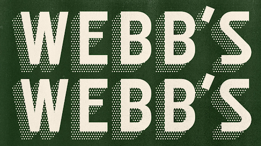
A retro-style design will never go out of style in my opinion! I love to nod to older styles when the opportunity presents itself. A lot of brands are following suit by utilizing “duller” neutral colors like oranges and browns and pairing them with grainy photography to create a film-like facade. Retro takes a minimalist approach, utilizing bold typography and large, color blocking shapes. This creates a nostalgic, raw feel that makes brands feel trustworthy to their consumers. In an era where art and design was poured into with more heart and soul, this gives the feel of a time when everything was made by hand with great attention to detail.


コメント